Branding Controls For Mobile & Web
The Korbty CMS has a section for you to brand your system. Selections made here will have effects on other parts of Korbyt as well.
Written By Ed Kinne
Last updated 8 months ago
This article focuses on how those settings will affect the Mobile & Web Experience that your users interact with

These settings are shared by other systems within Korbyt, so be mindful of any additional effects they might have.
Colors
Colors are used throughout the Korbyt mobile app and web interface as follows:
Primary Color:
In the Korbyt Anywhere Mobile App, the primary color sets the Top Banner
In the Korbyt Anywhere web interface, it’s used for the header, footer, and backdrop for posts.
It is also used for the login window for the Desktop Application
Secondary Color:
In Mobile and Web, it is used for page and section titles across the web interface.
Tertiary Color:
In Mobile and Web, it is used for navigation buttons, the Add Content button, and the Subscribe Button for Categories
You should use different colors for your primary and tertiary color choices, as well as the background color of your login page. Otherwise, users will have difficulty seeing the login button.
Global Font
This selection will only be available on tenants that have Mobile and Web enabled.
The selection of Global Font will be applied as the starting font choice when composing the News Feed Article Post
Logos
Stacked Logo
Appears in both the Korbyt Anywhere mobile app and web interface within the login screen and header.
Suggested Size 120px X 60px
Suggested Aspect Ratio: 2:1
Stacked logos and favicons should be uploaded as PNG files with filenames formatted without spaces
Horizontal Logo does not impact the Mobile and Web Experience
Icons
Favicon
Appears in the Browser tab when accessing the Korbyt Anywhere web interface.
Suggested Size: 16px X 16px
Suggested Aspect Ratio: 1:1
Custom Loader
If a GIF is added, it will animate
The image appears while the network loads the requested page within the Korbyt Anywhere web interface if the user is on a slower network. Some pages may take longer to load.
It will also appear in the Desktop(InView) Interface when data is loading
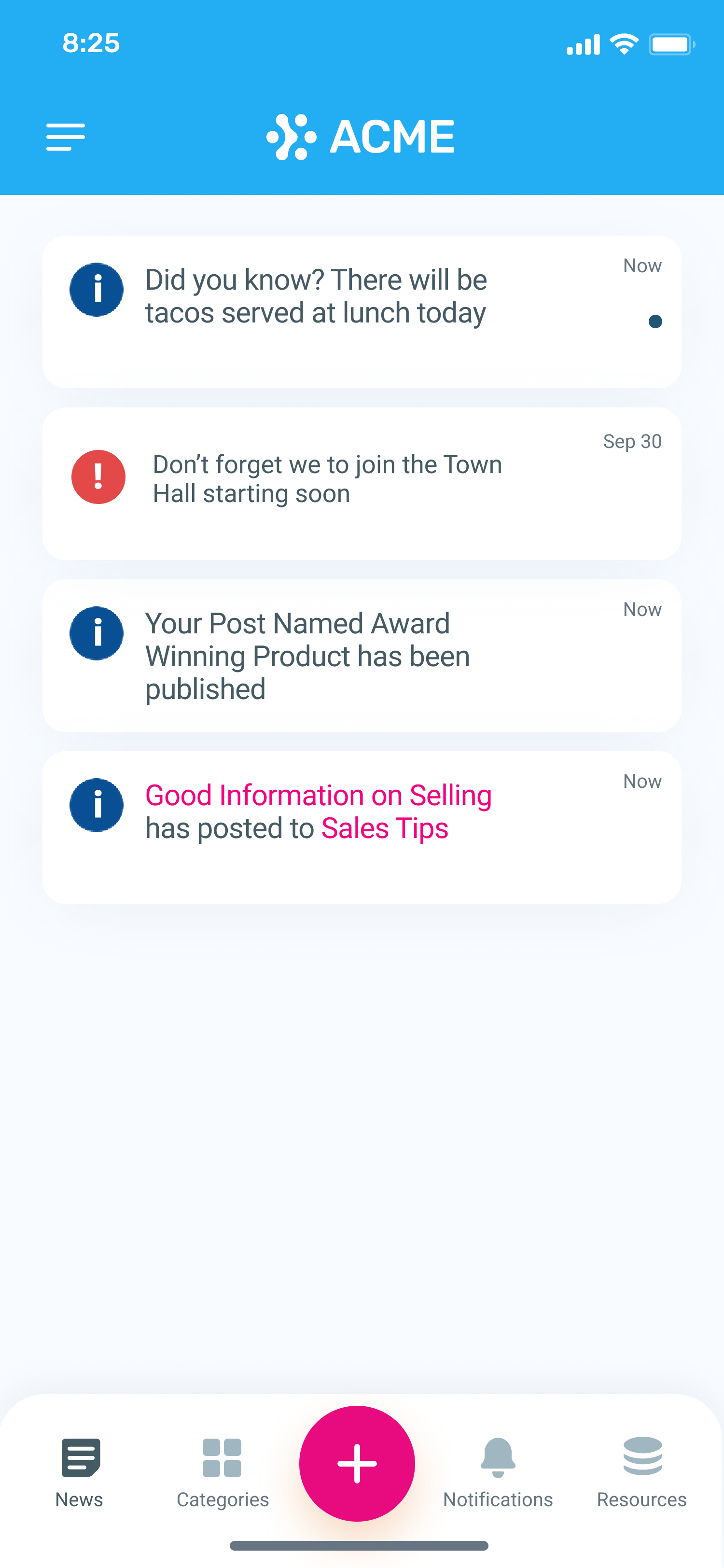
Push Notification
The Icon that will appear in the Notifications menu within the Korbyt Anywhere mobile app and web interface when a general notification is sent
Urgent Alert
The icon that will appear in the Notification menu within the Korbyt anywhere Mobile app and Web interface when an Urgent message is sent
The image below shows both the default Push Notification and Urgent Alert Notification Icons
The recommended size and aspect ratio are as follows:
Size: 250px X 250px
Aspect Ratio: 1:1
We support ICO files.
Background Type
Background options will only be present in tenants that have Mobile & Web enabled
The dropdown provides the option to change the background of the Web Experience login page.
Default
A Purple and Blue Gradient as seen here

Image Background
Allows you to load your own image file
The file name should be formatted without spaces

Solid Color Background
Allows you to set a specific color value for the login screen

Chrome Tab Name
Chrome Tab Name option will only be present in tenants that have Mobile & Web enabled
This allows you to change how Chrome will name a Tab with your Web experience open in it