Guide To Creating Predefined Layout Templates
Creating and Managing Predefined Layout Templates for Webform Submission and Launchpad Publishing
Written By Ed Kinne
Last updated About 1 month ago
The Korbyt Content Management System provides several paths to streamlining content creation and submission with Predefined Layouts
This guide reviews the workflows at a high level to help you decide which is right for you, then takes you through the steps to create and manage these templates
You can skip to any section using the On this Page section to the right
Overview
Predefined Layouts are designs, that once published, give users a way to enter values, such as changing text or inserting a picture, but only in the ways that you have specified.
Locating Predefined Layouts
Predefined layouts are in a specific section of the Layouts Screen.
Open the Mega Menu, and then under Content, click on Layouts
Click the Predefined Layouts icon in the upper right (between filter and files).

You are now on the Predefined Layouts Screen
Different Submission / Use Case Workflow
After you build and define the Template, how a user interacts with it will define the workflow. One Predefined Layout Template can be simultaneously used in all three workflows.
Web Form Submission
Launchpad Template
Builder Tool Starting Template Design
THe three are reviewed below, and in greater detail in specific articles
Web Form Submission
Anyone can make a submission that has access to the URL; they do not need to be a Korbyt Users.
Submitted content requires approval by default.
Can have further automation configured to put approved designs onto screens automatically.
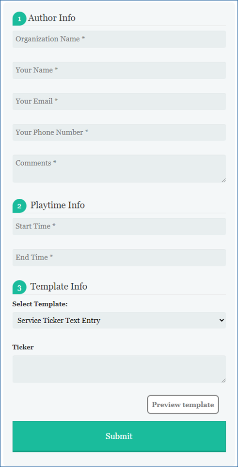
User completes a web-based form, filling in text, selecting or uploading images, and submitting their draft
The user does not have to be a registered Korbyt CMS User
Can only change the contents of elements that have been set to be “templated”
Can enter the text, but formatting is locked
Can not edit elements that have not been set to be adjustable
Can not add new elements that were not part of the design
When submitting, a new Layout is created in Draft Status
This would require approval by a registered Korbyt Content Approver or Higher before it can be seen
There is an optional setting that would auto-publish any submitted design
Can be automated to screens or sections of screens, once approved and published, through a combination of Tags, Validity Dates, and Clever Playlists
LaunchPad
Have to be a Korbty CMS User to Access.
Shares templates in a visual format.
Can be configured to allow the users to select specific players or playlists to have the content added to.
By default, the Launchpad system does not require further approvals from others to be published, but this can be changed to require approvals within your tenant.

A Korbty CMS User navigates to the Launchpad section and selects a template.
Which templates a user has access to can be controlled through User Groups and Folder Permissions
Can only change the contents of elements that have been set to be “templated”
Can enter the text, but formatting is locked
Can not edit elements that have not been set to be templated
When submitted, a new Layout is created in Published Status
This is the default behavior; it can be changed to require an Approval.
If set to require approval, the creator will select the users who will be notified that the new content needs to be approved.
Can be automated to screens or sections of screens by having it create a new playlist, add to an existing playlist, or through a combination of Tags, Validity Dates, and Clever Playlists that already exist.
Builder Tool Starting Template Design
A way to give Content Creators access to a design to copy a format, while also allowing them the freedom to alter it as needed.
Can have Tags and Validity Dates added after being published.
When a CMS user creates a New Layout, they have the option to select the predefined layout as a starting point instead of just a Blank page

This will open the Builder Tool, creating a new Draft design that the user can fully edit
They have full authoring over all elements of the design
An element being “templated” does not secure it in this workflow
The user can delete or add Elements
Elements can be locked through the Security option, so only certain user groups can edit them.
This does not stop a user from covering up or obscuring the locked element by adding another element over it, but it can stop any accidental changes to locked elements
When the user is done, their ability to publish the design will depend on their User Role in Korbyt
If they are Authors only, they will save in draft status and request approval
If they are Approvers or higher, they can publish for themselves
Tag and Validity Dates would have to be manually added
Creating New Predefined Layouts
To create predefined layouts:
Open the Mega Menu, and then under Content, click on Layouts
Click the Predefined Layouts icon in the upper right (between filter and files).

Click Add Predefined Layout. (or clone a Predefined Layout)

Configure your Template:

Provide a unique name
Optional – Add a Unique Tag,
This tag will be automatically attached to all Webforms and Launchpads submitted
This tag can be combined with a Clever Playlist to automate the items to the right screens
Optional – Category Drop Down
Sets the Category that the template will be listed in
This affects Launchpads and creating new Layouts; it does not affect Webform
Configuration Check Boxes
Enable as Launchpad
If checked, it will add this template to the Launchpad Area of the CMS
If Unchecked, it will not be available as a Korbyt Launchpad and will only be available as a web form
Publish to Players/Player Groups – Applies to Launchpads
If checked, the Launchpad will allow the user to create a New Playlist directed at the selected Players or Player Groups the user has access to, and will be shown as Full-Screen Content
If turned on, the user will be forced to make a Player/Group selection OR select a Playlist if also turned on.
Publish to Playlists – Applies to Launchpads
If checked, the Launchpad will allow the user to add the new content to an existing playlist.
If turned on, the user will be forced to make a Playlist selection OR select a Player/Group if also turned on.
These options can be edited after initial creation of a predefined template by clicking on the edit info icon (lower case i in a circle)
Click Create.
This will open a new Layout in the Builder Tool
You will use the Builder Tool to create the initial design, adding elements and placeholder values
For information on using the Builder Tool, see Using The Builder Tool For Layouts Or Messages
Add the elements for your design as normal, then
Templated Elements Properties
For Elements that are meant to be edited by the end user, you will need to specify that it is “templated” in the Element’s Attributes
Click the gear icon in the upper right of the square field and select Properties.

Click the Attribute tab.

Add a Label
This is the name for the field that the user will see in the Webform Submission screen and on the Launchpad screen
Click the Check box for “Templated” and set any Additional Controls for the Element

Elements that have Template Options for both Web Submission and Launchpad workflows
The Elements listed below will operate in both Laundpad and Webform Submission workflows, but the way they operate in both might be different.
Element | Templated Control Settings |
Text-Note Template Options |
|
Image Template Options |
|
Video Template Options |
Video Elements do not allow any templated specific behavior 
|
Sound Template Options |

|
Ticker Template Options |

|
QR Code Template Options |

|
Document Template Options |
|
YouTube Template Options |
|


Elements that have Template Options for Launchpad Workflows ONLY
The elements listed below will only be available through the Launchpad publishing process. They do not work in the Webform Submission process
All of the elements below, in their Attribute tab, only have the Label and Templated check box for their configuration.
External URL Template Options in Launchpad |
|
Vimeo Template Options in Launchpad |
|
Google Sheets Template Options in Launchpad |
|
Google Slides Template Options in Launchpad |
|
Salesforce Template Options in Launchpad |
|
Tableau Template Options in Launchpad |
|
Power BI Template Options in Launchpad |
|
Chart Template Options in Launchpad |
|
Ranking Template Options in Launchpad |
|


Saving and Publishing the Template
After all customizations have been implemented, click one of the following buttons at the bottom of the Controls dialog:
Save: Allows the layout to be saved on the fly, ensuring that no changes are lost.
Publish: Makes the Template available to others for use based on the settings
AFTER PUBLISHING, click the info

symbol for the design in the Layout List to make sure that it has saved the correct configuration for your use (all checkboxes refer to different Launchpad options)

Using the Templates
Now that a Predefined Layout Template has been created, how someone uses it depends on whether it is used through the Web Form Submission Process or as a Launchpad.
The articles below go through the specifics for each