Quick Actions for Interactivity in a Layout or Message
Written By Ed Kinne
Last updated Over 1 year ago
Quick Actions allows designers to embed interactive logic and macros into any Layout.
This is done by using the UI to select an element, configure a trigger, and then the desired response.
Common Use Cases of Quick Actions:
Toggling visibility of a set message or element
Sending a command to an element like Playlist or Carousel to change which item is displaying
Refresh Data
Trigger animations
If you need more information on Layouts in general
You will want to have added your elements to your design before following these steps
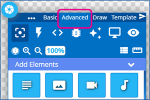
In the Builder Tool, select the Advanced tab of the control panel
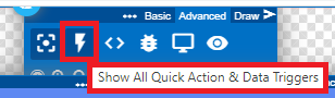
Click on the Lightning Bolt icon to open the Quick Actions and Data Triggers panel
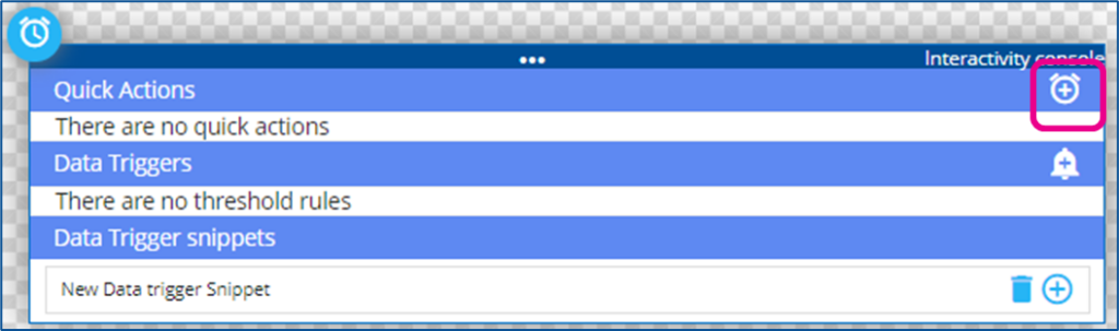
If you have not added any elements to your design yet, you will only see the option for snippets
To add a New Quick Action, click the + to the right
Select Element – You will then be asked to select an Element
This is the element of the design that is going to be monitored for the intended trigger
It will be helpful if you have renamed your element layers to be clear to you
Tigger: After selecting the Element, you will select a Trigger from the drop-down
Click – the element is clicked/tapped
isShown – if the element is set to be shown
isHiden – if the element is set to be hidden
Timer – Set an amount of seconds
Action: Select the desired result from the drop-down
Show / Hide / Toggle Visibility – all change the state of an element, displaying or not on the design
Add / Remove Class – Changes the classes of the element
Animate – Triggers a selected animation on the target element
Reload – Refreshes and reloads the target element
SubZone – Provides interactive instructions inside of an existing element calling up a webpage or another design
Player – Passes instructions to the player
Playlist / Carousel API – Passes instructions to a specific type of element to control the changing of items shown, “Next”, “Previous”
Target: The item that the action will be taken on
Interaction / Class / Time
There may be a new section that appears to the far right, depending on the type of action and target element, where further configuration may need to be set
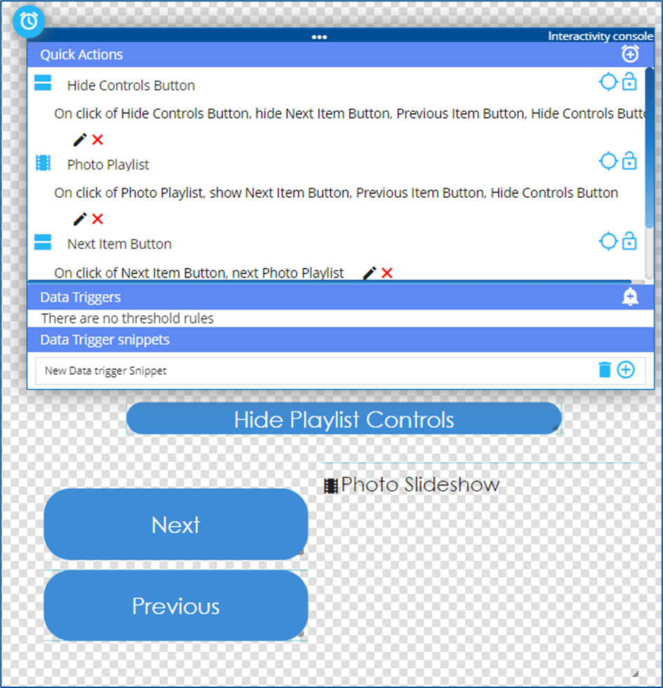
In this example, A quick action has been built to allow a user to move the Playlist to the next item, by clicking on the Next Button
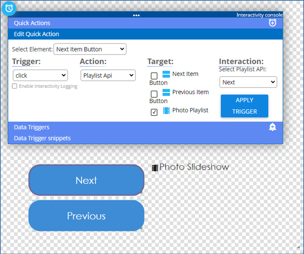
Click Apply Trigger to save the action
Multiple Actions can be created, and any element can be treated as the trigger element
Multiple elements can also be targeted with the action
In this example, a user clicking on the playlist is the trigger for showing the Playlist controls and making the hide controls button seen
Clicking the Hide Controls button hides all the control buttons.
Note on Visibility Toggles
If it is intended that an item be hidden unless some action is taken, then it needs to be toggled as hidden in the Element Layer list when the design is published.
This is done by manually toggling the visibility with the eyeball icon
From my previous example, if the controls are intended to be hidden until someone clicks the playlist, I would need to hide the control elements in the layers before publishing.