How To Use a Form Builder Element
The form builder element allows you to build an interactive form that someone could fill out on a Kiosk or other interactive implementation.
Written By Ed Kinne
Last updated Over 1 year ago

To Create Forms in the Form Builder
In the Builder Tool, click and drag the Form-Builder Element from the control panel to the canvas

Select the gear icon by hovering over the top right corner of the element and then selecting “Edit Element.” A new row of icons will appear above the element.

Use the Available Option to build your form
Icon | Setting Description |
 | Font Size set the font size for the whole form |
 | Font Color allows you to change the font text color for the entire form |
 | Font Family allows you to select the font for the entire form. |
 | Background Color allows you to set the background color for the entire form |
 | Form Name allows you to name this specific form. Will be used to track responses. |
 | Build Form allows you to add sections to your form, building it the specific question types and responses. |
Form Builder Section Types
Each form section will have a pencil icon in the upper right to edit the space
Seciton | Description And Setting Options |
Heading Text |  Creates a section of larger text |
Text Box |  Creates a Space for the user to enter text |
Text Area |  Similar to Text Box, but does not support forced text shape like email, number or password |
Dropdown List |  Creates a space where the user selects an item from a dropdown list |
Check Box |  Creates a space where the user selects values from the options presented |
Radio Button |  Creates a space where the user selects ONE value from the options presented |
Submit Button | Adds a submit button |
Cancel Button | Adds a cancel button |
Use the sections above to build the form you would like completed
You can have multiple of each field type if needed
You can drag the question boxes to move them to different areas of the screen
Once completed, publish the Layout containing the form and add to your interactive kiosk or sonar-based playlist
To View Responses to Forms
To access your Signage and Desktop reports, click on the Mega Menu in the upper left corner, then click on Reports, in the Analytics column
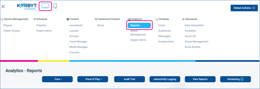
Click the Core drop-down, and select Form-Builder Reports
Form-Builder Reports
Report Information Includes: Form Name, Parent Content Type, Content Name, and Created Date
Can be filtered by: Start Date, End Date