How To Use a Button Element
The Button Element makes it easy for you to place and customize a button that can be used in interactive applications like Kiosks
Written By Ed Kinne
Last updated Over 1 year ago
What is the Button Element?
The Button Element makes it easy for you to place and customize a button that can be used in interactive kiosk applications. You can customize nearly every aspect of the look and feel. Knowledge of JavaScript, jQuery, or at least CSS selectors and Korbyt’s Quick Actions feature is required to use all this Element effectively.
What Can a Button Do
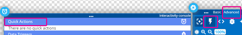
Buttons can be used to activate Quick Actions that cause changes inside this design
They can be used inside the Kiosk Builder to be used to navigate to other Kiosk pages
They can be used to connect to other external systems through custom CSS and JavaScript
What Can Act as a Button
Any element that is on the canvas of a Layout or Message can be used as an interactive button that can be clicked to make actions happen in the design, you do not need to use Button Elements for interactivity, but they can offer some advanced options that an Image Element or some other type of Element doesn’t offer
Adding a Button Element
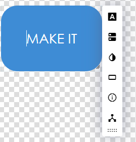
When you add a button element, it will begin with a default design with the text “MAKE IT”, you then use the menus to customize the look and behavior of the button
Editing a Button Element
Icon | Setting Description |
 | Text Styles Sets the text and text characteristics 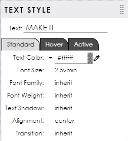 |
 | Icon allows you to add an optional icon from libraries 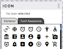 |
 | Styles quickly pick a starting design 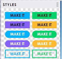 |
 | Button Style can set and define different design elements for Standard / Hover / and Active states 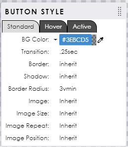 |
 | Icon Styles set and define the Icon desgin for Standard / Hover / Active states 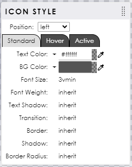 |
 | Button Type advanced options for linking the button to items outside of this one design |